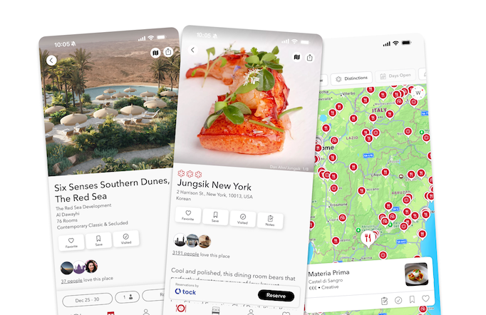
The star and the Bib Gourmand symbols might be the most iconic logos in the MICHELIN Guide but in fact, each annual publication is navigated by a series of small pictographs placed strategically around the page. This lets the user identify the restaurant’s strengths in a jiffy whether it’s on the contents page or on the listings itself.
Here’s six you should know:

The best way to experience the heart of Taipei food culture is to savour hawker fare. For that, there’s the symbol of a two-wheeled cart with a little roof. This denotes the physical characteristics of the establishment rather than the quality of the food. The icon also extends to bite-sized snacks from street food stalls.

If you are looking for establishments with an excellent wine list, keep an eye out for this symbol. It covers a spectrum ranging from lists presented by sommeliers in luxury restaurants to simple spaces with a passion for wine. The wines are usually available in an array of flavours and style that complements the cuisine.

These three crimson rays indicate particularly breathtaking sceneries for diners to enjoy while tucking into their food. This could mean a restaurant with a view of the harbour, or overlooking the glittering lights of the city come nightfall.

The patio parasol represents the option of terrace dining for the diners, or a relaxing meal in an open-air environment.

Simple shops that offer great food despite their casual environment are to be found everywhere and that’s no different from the MICHELIN Guide. Not to be confused with the street food category, it denotes a humble space where the service and physical aspects are unfussy. Several Bib Gourmand recipients are excellent examples.

The counter symbol denotes the dining option in an open kitchen concept, where chefs are observed up close from the counters; a full view of the chefs in full action. This allows customers the novel experience akin to watching a live cooking programme.


