“Don’t take yourself too seriously” is a characteristic phrase of our modern day. But how exactly does one de-program to take themselves less seriously? This was something Michael and Lindsay Tusk, husband-wife owners of Quince, examined for the San Francisco restaurant’s latest redesign.
The Tusks worked with two design firms to fulfill their vision of a warm, lived-in ambience: Diego Delgado-Elias was responsible for the interior architecture while Steven Volpe and his team curated the furnishings. Ultimately, they created a dining room that evokes a “cozy cocoon-like feeling,” says Lindsay Tusk, as the restaurant’s corners were rounded and the curved radius of the new banquettes present more of a soft space that encourages relaxation, “without feeling constrained by formalities.”
Perhaps the most notable “less self-serious” feature that contributes to the new ambience of Quince is the incorporation of natural light. Tusk explains how they strategically placed mirrors and openings to create “an airy atmosphere that invites visitors to circulate through the spaces.”

The redesign, aligned with Quince’s 20th anniversary, was inspired by the Tusks’ desire to emphasize a connection to Fresh Run, the Bolinas farm where produce is grown exclusively for the Tusks’ restaurants by third-generation farmer Peter Martinelli. The main corridor embraces guests into a winter garden lined with native trees planted in aged earthenware that opens to a dining room flanked by earthy hues like warm browns, soft pinks, and deep greens reminiscent of the farm’s landscape.
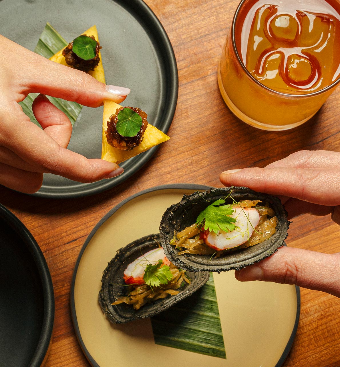
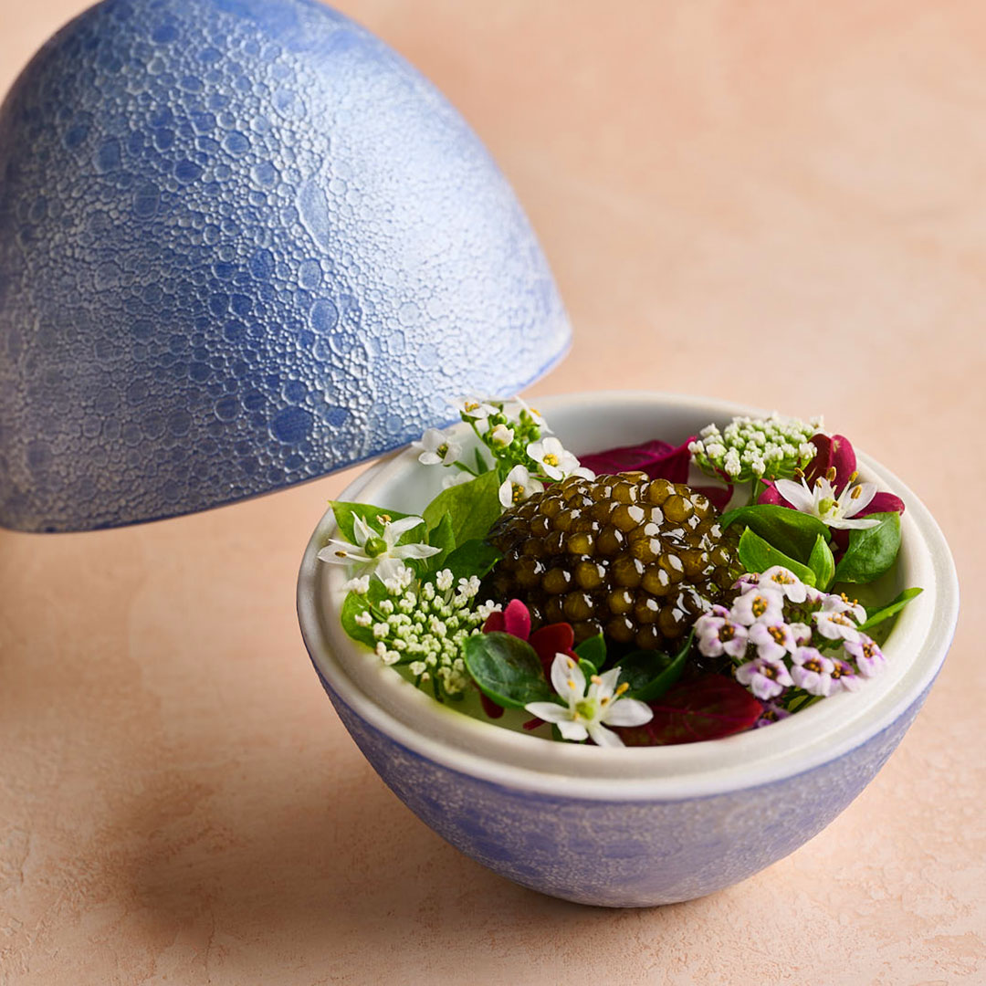
Beyond paying homage to the land, the Tusks also wanted a nod to the area’s artisans by sourcing clay plates handcrafted by local potters to highlight the farm-to-table ethos they embrace. “The plates are tangible expressions of the restaurant's commitment to supporting local craftsmanship and sustainability,” shares Tusk. They also sourced knives from metal worker Everett Noel located in the Sierra Hills, ceramic vases for the table from Frances Palmer, a friend of the Tusks for 30 years, as well as plates, cups, and bowls for the tabletop from TOKINOHA, a Kyoto-based artisan.
Below, Tusk explains more about the key elements of the redesign including more about the use of texture and their decision to scale down the dining room for a more comfortable experience.

Tell us about the use of textures — there’s a variety from steel walls to fabric paneled walls — why is texture such an important element for a restaurant?
Texture plays a critical role in enhancing the sensory experience of dining and creating a memorable atmosphere. From walls plastered with a textured finish for a visual depth, to the tactile warmth of fabric-paneled walls and curtains, each texture adds character to the space. Local wood accents allude to California's natural beauty, while fabrics provide a sense of softness and intimacy. Texture stimulates both visual and tactile senses, enriching the overall ambiance and making the dining experience more immersive and engaging.
Was scaling down the dining room to fewer seats part of the original plan or did it come to be while executing the redesign?
Scaling down the dining room was a deliberate decision made during the redesign process to enhance the overall dining experience. By reducing the number of seats, we aim to create a more intimate and personalized atmosphere for guests, fostering deeper connections between diners and the culinary offerings. While this may initially limit capacity, the focus on quality allows for greater attention to detail and service, ultimately enhancing the restaurant's reputation and attracting discerning clientele.

How do you think this will impact the future of the restaurant given less seatings and how do you plan to overcome this?
While we reduced the seating in the dining room, we increased the capacities in the bar and salon to create a variety of seating and experiences. Diners are now able to sit at the bar, or at slightly-lower-than-average-dining-height tables in the salon and lounge. The new seating options were driven almost entirely by diner requests and feedback. Guests hoped for an option that allowed for more spontaneity–the ability to drop in for one or two dishes or a cocktail without the commitment and time and formality of sitting in the dining room. Our sense was that diners wanted the ability to have friends join a party that had already been seated. They wanted an offering that wasn’t so rigid, and had more of a dynamic flower.
What was the most challenging part of the redesign?
One of the most challenging aspects of the redesign was the departure from traditional right angles in the restaurant layout. While unconventional, this design choice was essential in creating a more dynamic and fluid space that encourages exploration and interaction. Adapting to curved walls and irregular angles required careful planning and execution, but ultimately resulted in a visually interesting and engaging environment that reflects the restaurant's innovative spirit.

Hero image: Leslie Williamson / Quince


